
The brief
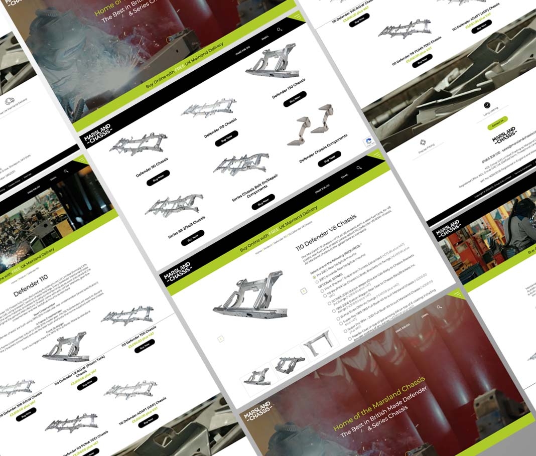
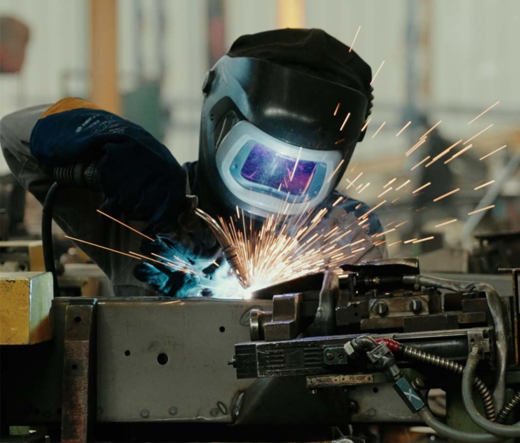
We were asked to create a user-friendly eCommerce site that has immediate impact and an intuitive user journey. The client asked for a stripped back look with an emphasis on a black and white palette. This we delivered but we also made use of a striking green accent colour too which the client was very pleased with, as reflected in their feedback – ‘really pleased with these pages’ and ‘more than pleased with the design and layouts’. The addition of well photographed product imagery, some striking manufacturing shots and homepage video, ensures a great looking site.
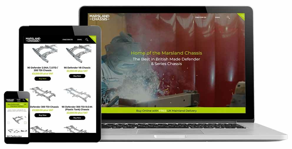
Of course we needed the designs to work on responsive screens too, as that’s where the majority of their traffic comes from, so the design process covered this area in detail too with designs for iPad (both portrait and landscape) and also smart phone sizes. These are always done as part of any digital project, as much for the benefit of the development team to work from, to ensure the UX is perfect on all devices as for the client during the design process.


Product Pages
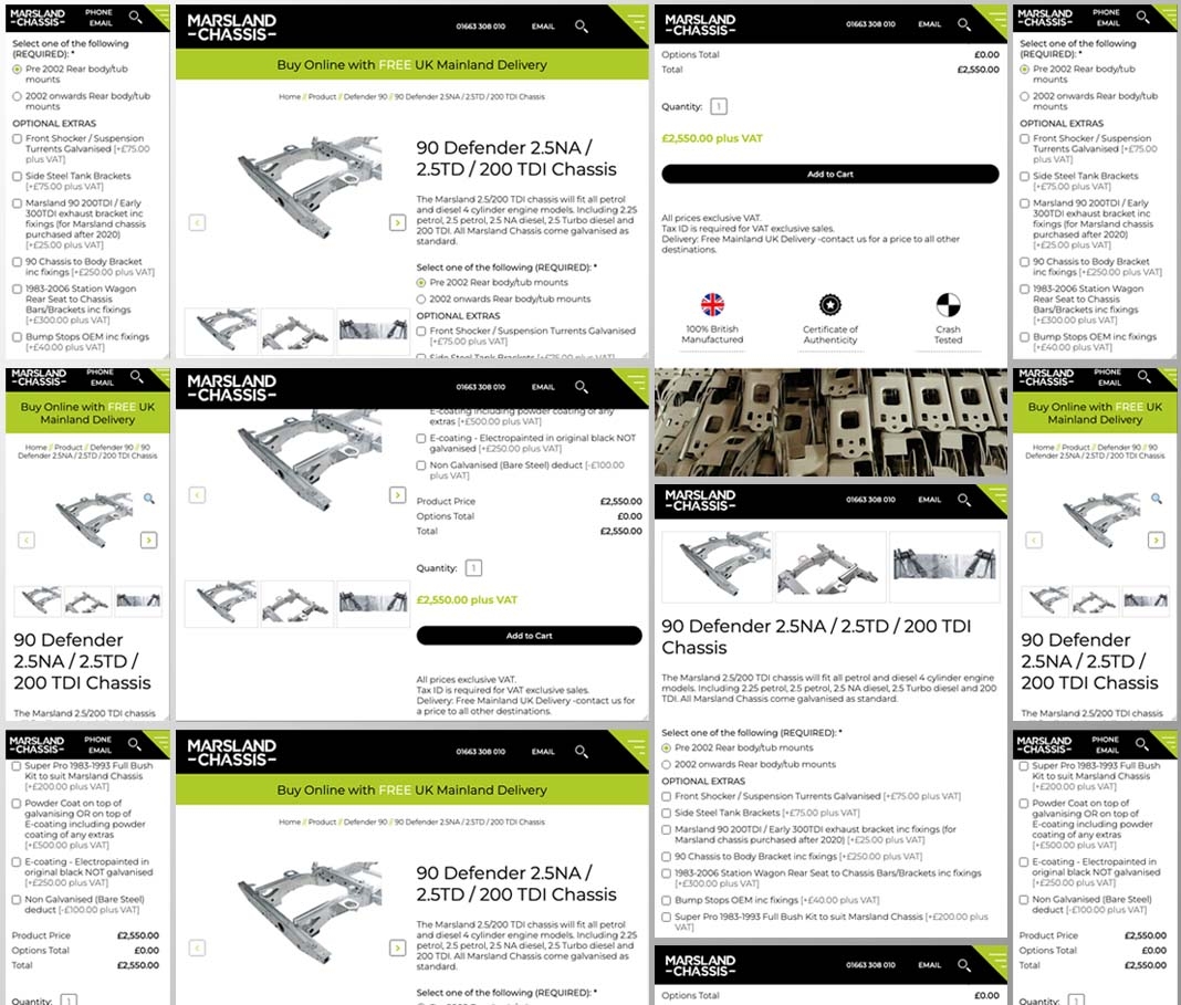
The product pages were designed and developed so that the product images remain anchored in view as the page scrolls, and also made use of functionality that ensures that any optional extras that are chosen (of which there are a few) automatically updates the price accordingly. This is an important feature as many of the chassis have an extensive list of optional extras that are essential to ensure that the required chassis (with all it’s potential variations) fits the correct vehicle.
This also helps with a pleasing UI and also a seamless UX which benefits the end user.

