Alufold Direct
AluFold Direct are leading suppliers and installers of high-quality bi-folding doors, windows, glazing and roofing. Based in Blackburn, AluFold Direct are able to work anywhere in the UK.
We were tasked with creating a high-end brochure which combined product and technical details with a coffee-table, lifestyle book approach.
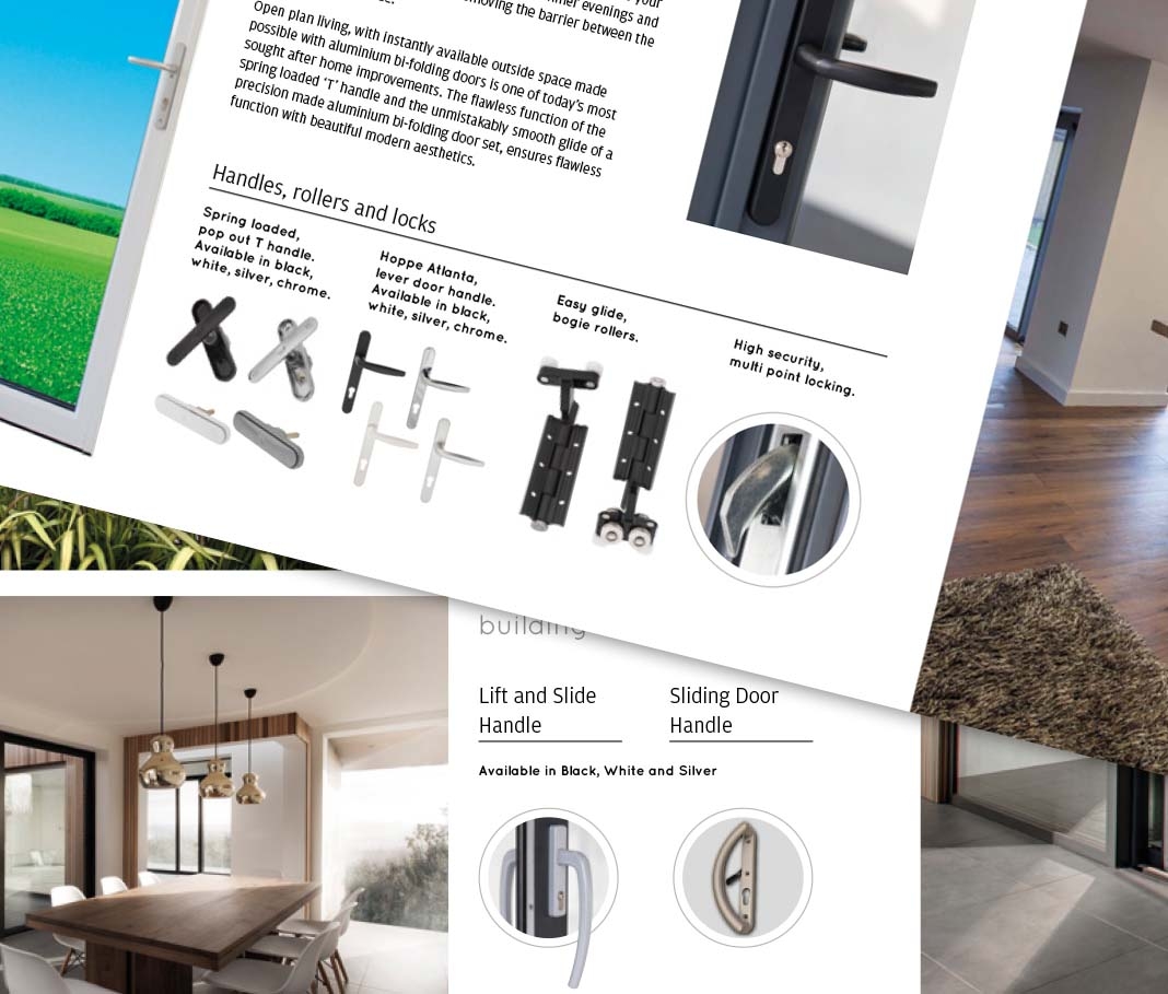
We created several moodboards and a concise brief for our photographer, to ensure we got the right mix of images. We needed close up shots of hardware such as handles, hinges, locks and frames, in order to illustrate the incredible range of colours and finishes available to AluFold customers, as well as dynamic on-site shots of homes and businesses who had commissioned work from AluFold Direct.
We opted for a landscape orientation for the brochure, which worked really well with the photography and emphasised many of the product features that are offered by AluFold Direct. This also meant that the brochure stood out amongst a crowded and competitive marketplace, which in turn was more likely to drive customers back to AluFold once their decision had been made.
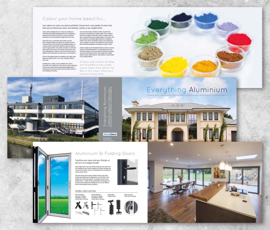


Special colours
In order to emphasise the aesthetic nature of the product, we kept written content to a minimum throughout the brochure. The content which was included enhanced the experience of looking through the document, highlighting features of the products including many of the safety features and options available for each range.
Once the design had been completed, we moved on to the print stage.
During the print process, we made use of a special metallic fifth colour, in order to give the brochure a high quality feel, matching the levels of the quality of the products it was designed to showcase. In addition to this, we also used a high GSM paper with a luxurious finish, to ensure that not only was the brochure of a high quality feel, but also had a longer shelf life than the collateral of AluFold’s competitors.
So successful was the brochure that it went through six additional print runs, as the sales staff reported that it made a huge impact on clients and aided numerous sales conversions.