Eleganza
Brand Design + Website + Hosting + SEO + Content + Ads Management + Monthly Marketing Support
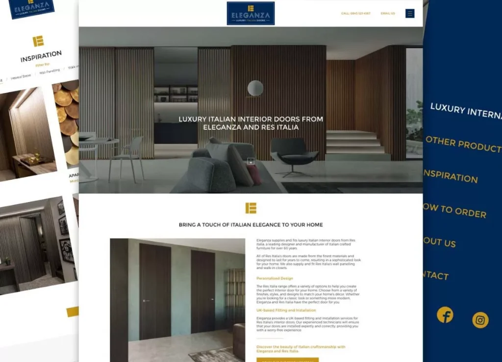
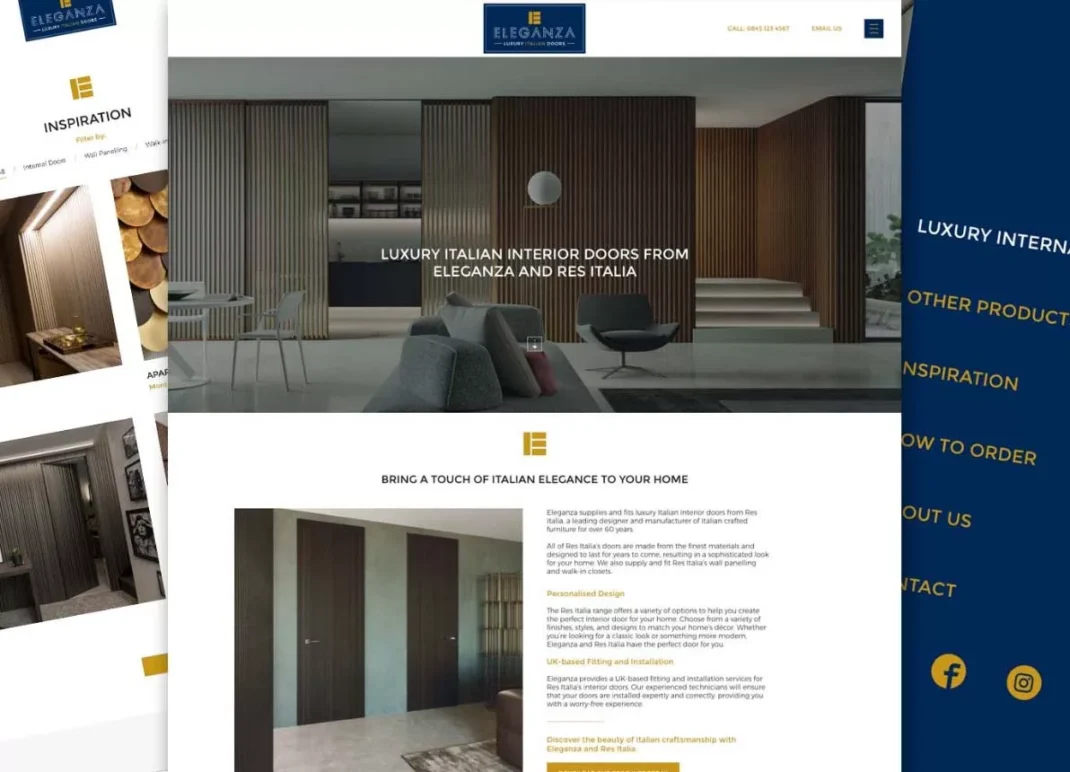
Eleganza supplies and fits luxury Italian interior doors from Res Italia, a leading designer and manufacturer of Italian crafted furniture for over 60 years.
All the doors are made from the finest materials and are designed to last for years, as are the wall panelling and walk-in closets. The end result is a high-end product and a sophisticated look
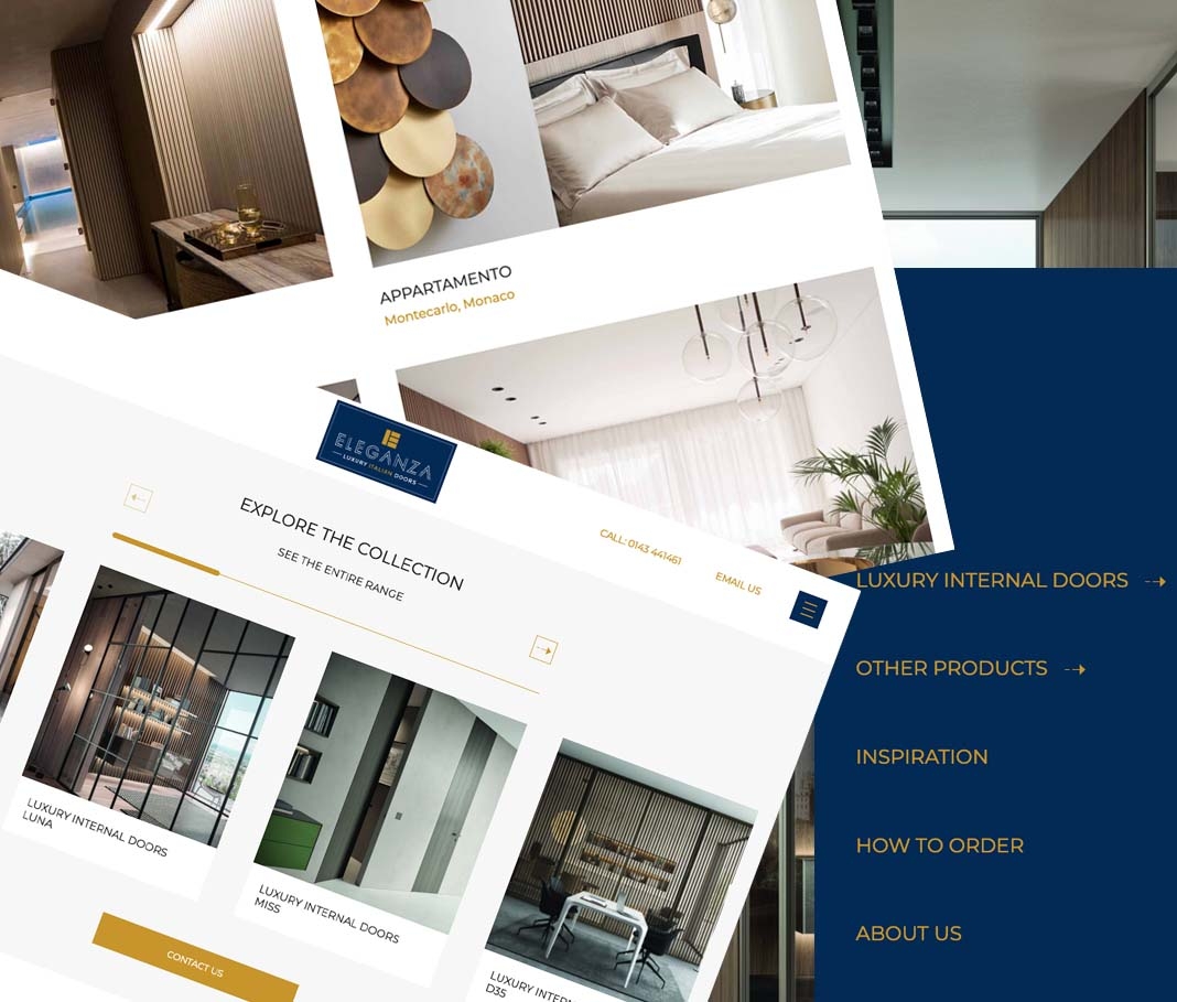
The Branding
The first task was to create some impactful and elegant branding – something that reflects the high quality and modern lines of the Italian doors.
The rich tones of the dark blue and gold, combined with the striking typography, was a hit with the client. The ‘E’ icon that we created also gave us a vehicle that we could use as a brand reinforcement exercise throughout the website.
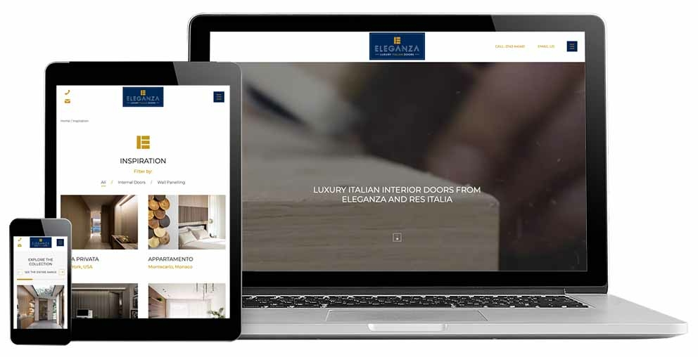
The Website
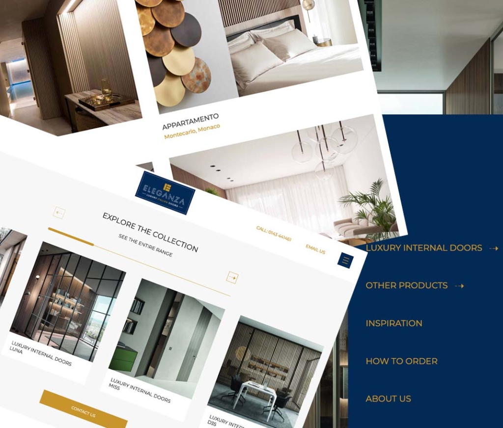
Like the branding, the website had to be elegant and clean – easy to navigate and (of course) great looking on mobile devices. The homepage ‘explore the collection’ doorway area features a scrolling function, which is seamless and intuitive. The ‘view finishes’ and ‘view handles’ options on the product pages are arresting in the use of UI, and encourage the end user to explore further. The same is true of the ‘view gallery’ areas, and the ‘inspiration’ pages make a nice finale to the product areas – showcasing as they do some really high end interiors and finishes.
The regular calls-to-action throughout, complemented by the ‘how to order’ page, make the process of making contact an easy and reassuring one. All-in-all, this is a project that both Kariba and the client are particularly delighted with.