AI TRANSFORMATION AGENCY
AI Powered Lead Generation for Smart Businesses
Curious about Voice AI?
Call Grace, Our AI Employee

Smart Websites
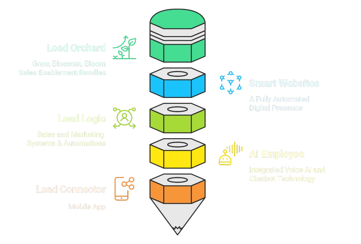
An AI-powered Smart Website goes way beyond a standard site, with integrated booking chatbots, customer service agents and automated lead workflows that convert visitors instantly.

Smart Leads
Our Smart Lead Gen bundle combines our powerful Lead Orchard CRM with AI sales bots to automatically capture, nurture, and convert prospects into paying customers effortlessly.

AI Employee
Our AI Employee is a cost effective voice agent that works 24/7, handling sales calls and customer service tasks while you sleep, go on holiday, or focus on growing you business.
WORK SMARTER, NOT HARDER
AI Solutions Your Bottom Line Has Been Waiting For

Save Time
Our AI solutions handle your repetitive tasks automatically, giving you back (on average) up to 5 hours weekly to focus on growing your business and increasing profits.

Save Money
AI eliminates expensive manual processes and reduces operational overhead, saving business owners thousands of pounds a month, whilst boosting efficiency and productivity.

Boost Profits
Generate more leads, close deals faster, and optimise operations automatically, directly increasing your monthly profits with minimal effort required.

Enhanced Reputation
Automated review requests consistently gather positive customer feedback, building your online reputation and credibility to attract more high-quality prospects effortlessly.

Stressless Tech
Our integrated software eliminates compatibility issues and system conflicts, giving you one seamless platform that just works without technical headaches or downtime.

Stay Connected
Our Lead Connector mobile app keeps you connected to prospects and customers anywhere, ensuring you never miss opportunities, even while you're on the move.
HOW WE DO IT
30 Years of Marketing & Tech 'Know How'
When you choose Kariba, you're not just hiring an agency – you're gaining three decades of refined expertise, battle-tested strategies, and an unwavering commitment to your success.
From start-ups finding their voice, to established enterprises scaling new heights, we've been the trusted partner behind countless stories of unparalleled business growth.

Who We Do It For
Here's How Our Experience and Integrated Tech Can Best Serve Businesses Like Yours

The Plumber
Challenge: Plumbers lose business to missed calls and waste hours on scheduling, invoicing, and admin tasks instead of focusing on profitable work.
Solution: Our AI Employee answers calls 24/7, automatically schedules appointments and manages admin - maximising your earning potential!

The Accountant
Challenge: Accountants drown in client queries and administrative tasks during busy seasons, limiting time for strategic advisory work.
Solution: Our AI Employee automates systems, answers client questions 24/7 and handles admin - freeing you up for high-value consulting!

The Beauty Salon
Challenge: Salon owners juggle appointment bookings, client inquiries and payments while trying to focus on delivering exceptional beauty services.
Solution: Our Smart Websites manage bookings 24/7, answers client questions and payments - letting you focus on stunning transformations!

The Security Company
Challenge: Security companies miss emergency calls, struggle with appointment scheduling, and waste time on quotes, while needing immediate response capabilities.
Solution: Our AI Employee handles urgent calls 24/7, schedules installations, and generates instant quotes - never missing critical security needs!

The Solicitor
Challenge: Solicitors spend countless hours on client intake calls, appointment scheduling, and document preparation instead of focusing on complex legal work.
Solution: AI handles initial consultations 24/7, schedules meetings, and prepares standard documents - maximising your billable hours!

The Builder
Challenge: Builders lose potential projects to missed calls, struggle with quote preparation, and waste time on scheduling while on-site.
Solution: Our AI Employee answers calls 24/7, generates instant quotes, and manages scheduling - keeping your pipeline full while you build!
Happy Customers
Proven. Powerful. Performance-driven. Partners.

Highly Experienced
16 enquiries in just 3 weeks, and already riding high in Google.
Good to work with an agency that knows what they're doing - Tap Security

A £350k Uplift
Kariba's new website resulted in a £350,000 direct sales addition to our turnover - Lily Comms

Outstanding Results
Kariba have helped create 40% growth in Year 1 and we're on to 43% growth so far in Year 2. This is an outstanding result - AlufoldDirect

Great Service
I can't recommend Kariba enough and look forward to working with them again - NHS Foundation Trust.

New Starters
The website continues to be a great source of enquiries and has helped secure a number of new starters - Belmont Grosvenor School

Best Decision Ever
Pete and I agree that commissioning Kariba was the best money we've ever spent - AudioVogue
Plans & Prices
Affordable Fixed Monthly Fees - No Contracts - Cancel Anytime
Smart Start
£95 pm
INCLUDES
Smart Website with Hosting
Social Media Scheduler
Lead Connector Mobile App
One Off Set-Up Fee: £295
Smart Leads
£295 pm
INCLUDES
Smart Website with Hosting
Unlimited Sales Funnels
Speed to Lead Automation
Lead Orchard CRM
AI Chat Widget
Automated Review Requests
Email & SMS Marketing*
Social Media Scheduler
Lead Connector Mobile App
One Off Set-Up Fee: £495
AI Employee
£495 pm
INCLUDES
1 x Voice AI Agent (inbound)*
1 x AI Chatbot
Appointment Booking
Customer Support Agent
Sales Support Agent
Calendar Integration
Help with Prompts
One Off Set-Up Fee: £495
All prices are plus VAT. Custom web builds will incur an additional upfront free and will be quoted separately.
* Additional charges for calls and emails apply (normally no more than £10 per month)
Join the Smart AI Revolution Today!
To book a Demo and a Free Discovery Call, simply fill out the form and our Smart Website will do the rest.

Curious about AI? Challenge Grace, Our own AI Employee, to sell your business' products and services back to you. Prepare to be amazed.
Click on the image above to begin the call.
Ready to Scale Your Business?
We only work with customers who have the capacity to grow. If this sounds like you, book a free strategy call today!

2 Sceptre House, Hornbeam Square North, Hornbeam Park, Harrogate, North Yorkshire HG2 8PB
Email: [email protected]
© Kariba Creative Media 2025 - Terms & Conditions - Privacy Policy